
Deliverables
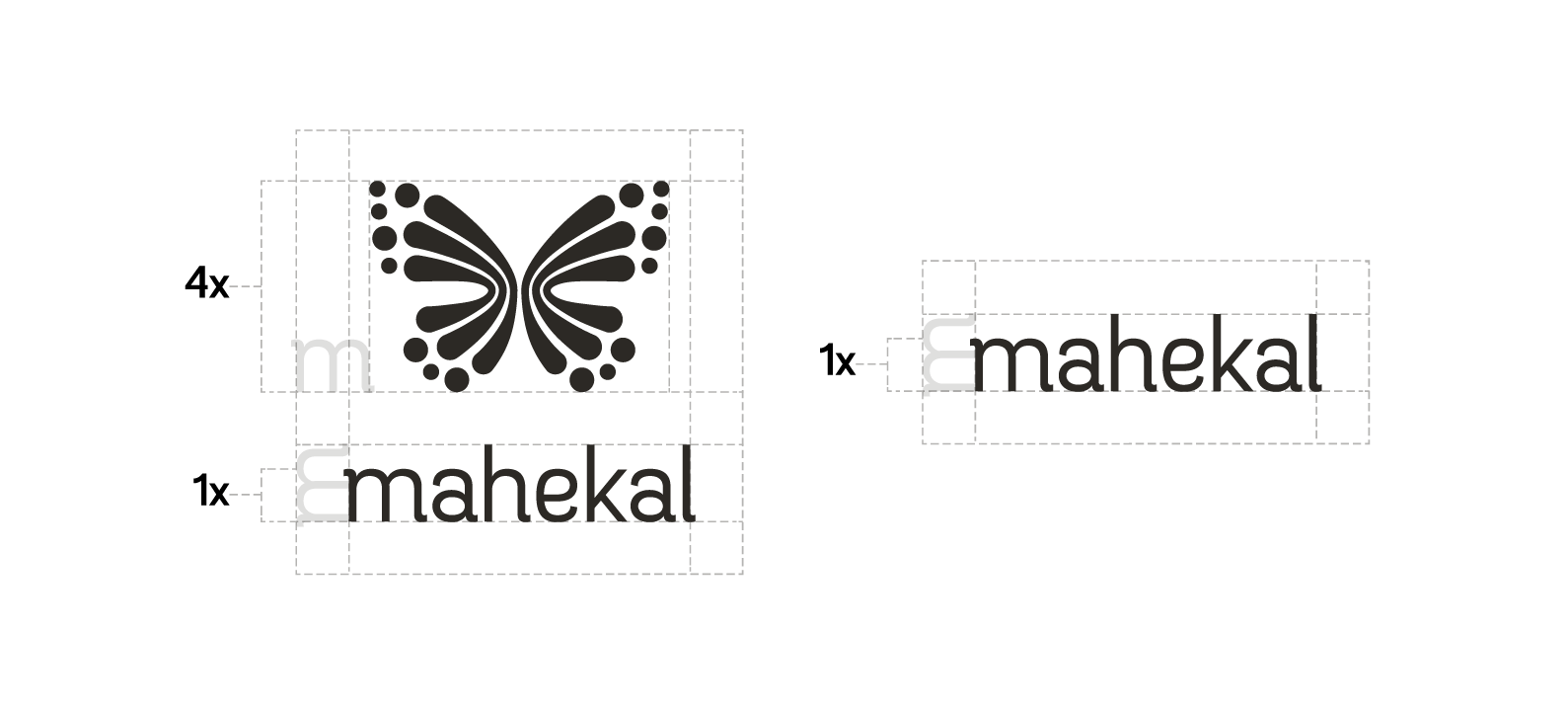
Logotype
Logo Family
Brand Book
Wayfinding
Logotype
Logo Family
Brand Book
Wayfinding
Back when I worked at the Tallahassee ad agency, BrightRed\TBWA, one of my first big projects was to rebrand a Mexican beach resort located in Playa del Carmen.
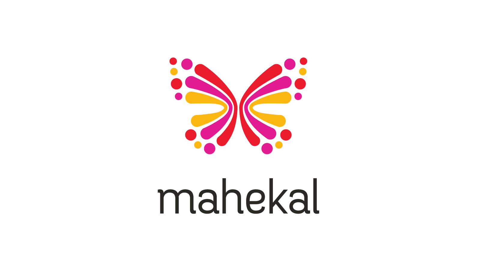
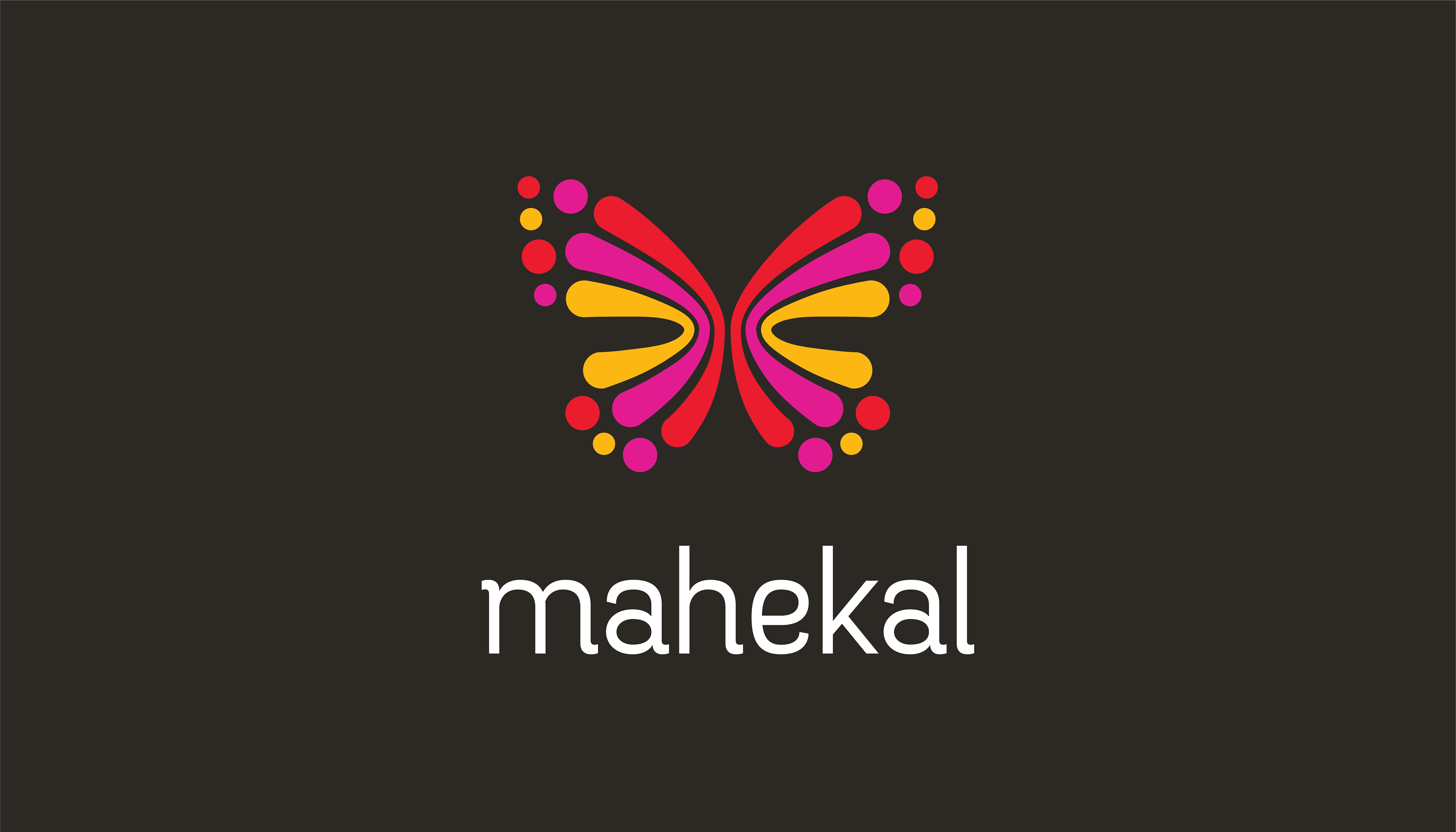
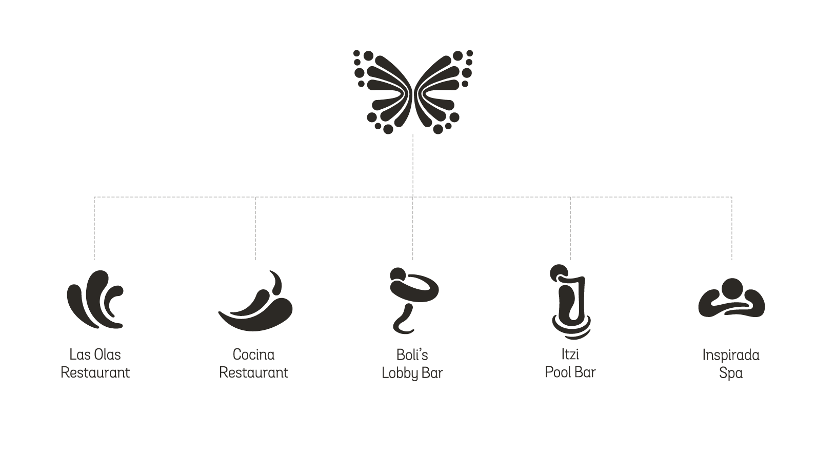
After doing a bit of research on the hotel location, I learned that the site was well known for the massive Monarch butterflies migrations that occur seasonally each year, so I incorporated the shape of a butterfly in the logo's mark.
The dots represent groups traveling, converging, and diverging, mirroring the the migratory patterns of butterflies and travelers alike.